
When it comes to selling online, your product pages are the heart of your website. But if you’ve been putting off making improvements, you’re not alone! It’s easy to feel overwhelmed when you’re managing everything by yourself or in a small team. The good news? With a few smart tweaks, your product pages can go from “meh” to magnetically persuasive — without feeling like a daunting project. Ready to dive in?
Let’s explore some simple, high-impact strategies to help you create product pages that convert visitors into customers.
1. Write product descriptions that focus on benefits
Many product pages make the mistake of listing features without showing customers how those features will benefit them. Sure, it’s important to explain what your product is, but people want to know how it helps them. Instead of getting caught up in technical specs, focus on the problem your product solves or the improvement it brings to their life.
Take the example of a chair. A plain description might say, “This chair is made of durable wood and has a cushioned seat.” That’s informative, but it doesn’t speak to what the customer really cares about: comfort and functionality. Imagine instead you describe it as: “Enjoy lasting comfort and support with this cushioned wooden chair — perfect for long workdays or cozy dinners at home.” Now, you’re painting a picture, helping the customer envision how the chair improves their everyday life. This shift in focus can make a huge difference!
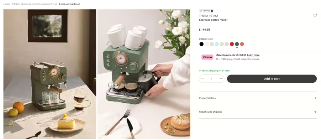
2. Use visuals to bring your product to life
Great product photos are essential, but too often small businesses rely on generic, flat images that don’t do their products justice. High-quality visuals don’t have to be fancy or expensive. What matters is showing your product in a way that helps customers picture it in their own lives.
For example, if you’re selling a coffee maker, instead of just showing it sitting alone on a counter, show it brewing coffee in a warm, inviting kitchen. Imagine this: your customer sees a beautiful morning scene with sunlight streaming in, the coffee maker brewing a fresh cup of coffee and a cozy mug waiting to be picked up. Suddenly, it’s not just a product — it’s part of an experience your customer can connect to. That’s the power of thoughtful visuals.
3. Create urgency with compelling CTAs
The standard “Buy now” button works, but it doesn’t always push people to take action. To really motivate buyers, your call-to-action needs to be clear, but also create a bit of urgency or excitement. Phrases like “Limited stock” or “Available today only” can prompt faster decisions. You could even play with the wording to add personality and fun.
Imagine you’re browsing an online store and instead of the usual “Add to cart” button, you see “Get yours before they’re gone!” It creates a sense of urgency and feels more personal. You’re not just asking your customer to buy, you’re encouraging them to act now before they miss out. A small tweak like this can have a big impact.
But, also don’t forget to be crystal clear! Thanks to a recent ruling from the Dutch Supreme Court, vague order buttons might not cut it anymore. So, while you’re being creative, make sure your CTA also makes it super clear that the customer is making a payment. A small tweak can have a big impact and keep you out of any courtroom drama.
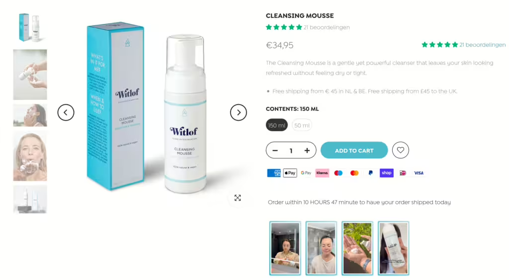
4. Boost trust with customer reviews
When people are unsure about making a purchase, they often look for reassurance from others. Including customer reviews or testimonials on your product pages is a great way to build trust. Even if you’re just starting out, don’t be shy about asking early customers for feedback. Offering a small discount or incentive in exchange for a review can help you collect some early praise.
Let’s say you sell skincare products. A review like “This serum cleared up my acne in just two weeks, now I won’t use anything else!” can go a long way in convincing a potential customer who’s on the fence. They’ll trust that the product has worked for others and be more confident in their own purchase. Displaying social proof like this doesn’t just build credibility — it helps your customers feel safe about hitting that “buy” button.
5. Keep the layout clean and easy to navigate
Clutter on a product page can be overwhelming and cause visitors to leave before buying. It’s important to keep your layout simple, clean and easy to navigate, especially on mobile devices. Break up the text with headings, short paragraphs and bullet points for easy scanning and make sure important information like pricing, shipping options and return policies is easy to find.
Imagine an online clothing store. Instead of cramming all the information into a single block of text, you have neatly separated sections for the “Size guide,” “Materials,” and “Shipping info.” This way, your customers can quickly find what they need without feeling lost. The more streamlined your product page is, the more likely your visitor will complete their purchase.
6. Create an FAQ section to lower buying barriers
Sometimes customers hesitate because they have unanswered questions. By adding a Frequently Asked Questions (FAQ) section directly on your product pages, you can help eliminate those doubts. Address common concerns like shipping times, return policies, or specific product details to boost confidence and make the decision process easier for potential buyers.
For instance, imagine you’re selling shoes. A potential customer may be unsure if they can return the shoes if they don’t fit. With a clearly visible FAQ question like, “What is your return policy for shoes?” you’re addressing that worry head-on. This gives customers peace of mind, making them more likely to complete their purchase without second thoughts.
Make small changes, see big results!
Optimizing your product pages doesn’t have to be a huge project. By focusing on a few key elements — writing engaging descriptions, improving visuals, adding customer reviews and simplifying the layout — you can see big improvements in how your visitors respond. And with Progress Planner, you can break down these tasks into manageable steps, so you never feel overwhelmed. Let’s tackle website procrastination together — one smart change at a time!