Creating an About page that truly connects with your audience is crucial for building trust and credibility. Your About page is more than just a summary of who you are; it’s a chance to tell your story and show the human side of your brand. In this post, we’ll walk you through the key elements of an effective About page.
Why create an About page?
So, why should you invest time and effort into creating an awesome About page? What’s the big deal? Your About page is essentially your storybook. It’s where you tell visitors who you are, what you do, and why you do it. It’s important because people are naturally curious about the faces behind a brand. This page helps visitors understand and decide whether they want to become your customers or regular readers.
Think about it: when you’re considering a purchase, a well-crafted About page can reassure you about the site’s legitimacy. Seeing a picture of a team and knowing they are located in your country can make you feel comfortable buying from them. Similarly, if you’re searching for fitness advice, knowing that the blog is run by a fitness expert builds trust in the information provided.
In short, a good About page builds trust. It’s a crucial part of converting visitors into loyal customers.
Checklist for your About page
What makes a good About page? Let’s break it down into content, design, and visual elements.
Content elements
Let’s start with the heart of your About page: the content. This is where you tell your story and connect with your audience on a personal level. Your content should be clear, engaging, and purposeful, answering the fundamental questions visitors have when they land on this page.
- Who are you? Share your name and where you’re from.
- What’s your story? Briefly describe how your business or website started.
- What do you offer? Focus on how your product or service solves problems for your customers. It’s about them, not just about you.

Design elements
After nailing down the content, it’s time to think about the design of your About page. A well-designed page is crucial for guiding your visitors through the content and ensuring they take the desired action.
- Call to action: Include a clear call to action. Guide readers to the next step, whether it’s contacting you, reading more content, or making a purchase.
- Length: Keep it concise. Aim for 250-600 words, and use subheadings to break up the text.
- Visibility: Make sure your About page is easy to find. It should be in your main menu or footer.
Visual elements
Visuals play a crucial role in making your About page not just informative but also engaging and memorable. They add personality to your brand and help to establish a connection with your audience.
- Photos: Include a photo of yourself or your team. A picture says a thousand words and helps humanize your brand.
- Videos: Consider adding a short video introduction. Keep it authentic and engaging.
For larger businesses or those with a more complex story, you might want to go further by including additional content like your company’s core values or short bios of your team members. This helps to create a fuller, more detailed picture of who you are and what you stand for, which can be especially important in building trust with your audience. Consider also adding testimonials or case studies that showcase your impact or success stories, adding yet another layer of credibility and connection.
Tackle that writer’s block
Staring at a blank screen? Don’t worry; we’ve got a simple template to get you started. Start by breaking your About page down into three key sections. This structure ensures you cover all the essential points while keeping your content organized and digestible.
- Who are we?
- A little bit of history
- What do we do for you?
Once you’ve outlined these sections, start by writing just a few sentences under each heading. Add a photo and a call to action, and you’ve got the basics covered! Don’t worry about making it perfect on the first go — just get your ideas down. You can always refine and expand as you go.
Inspiring examples
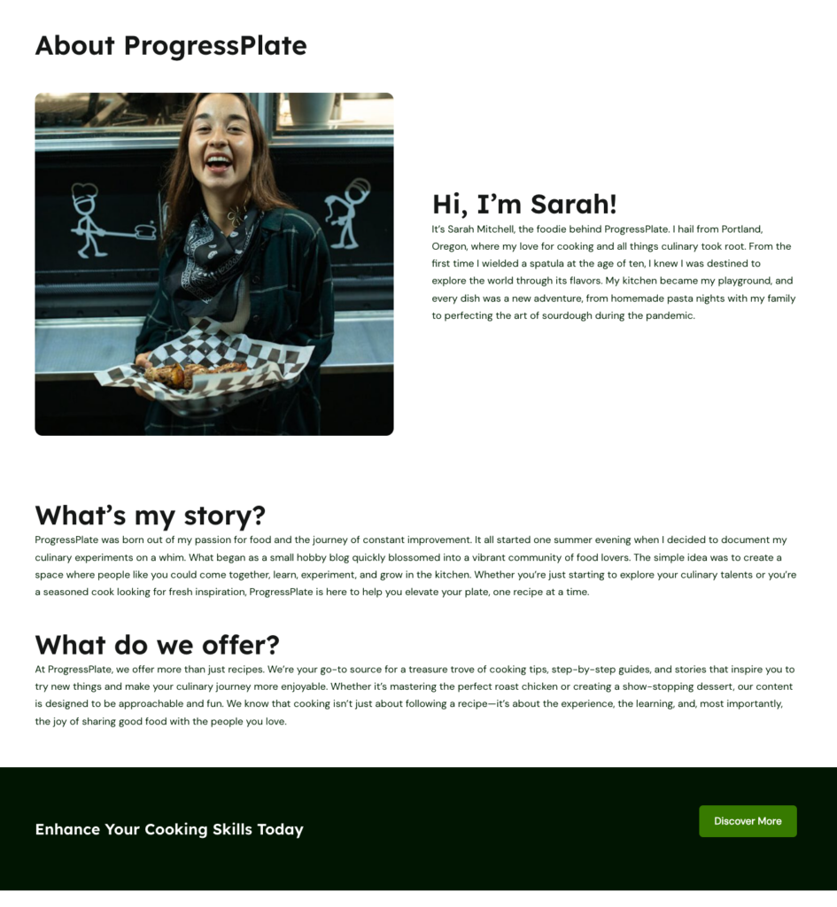
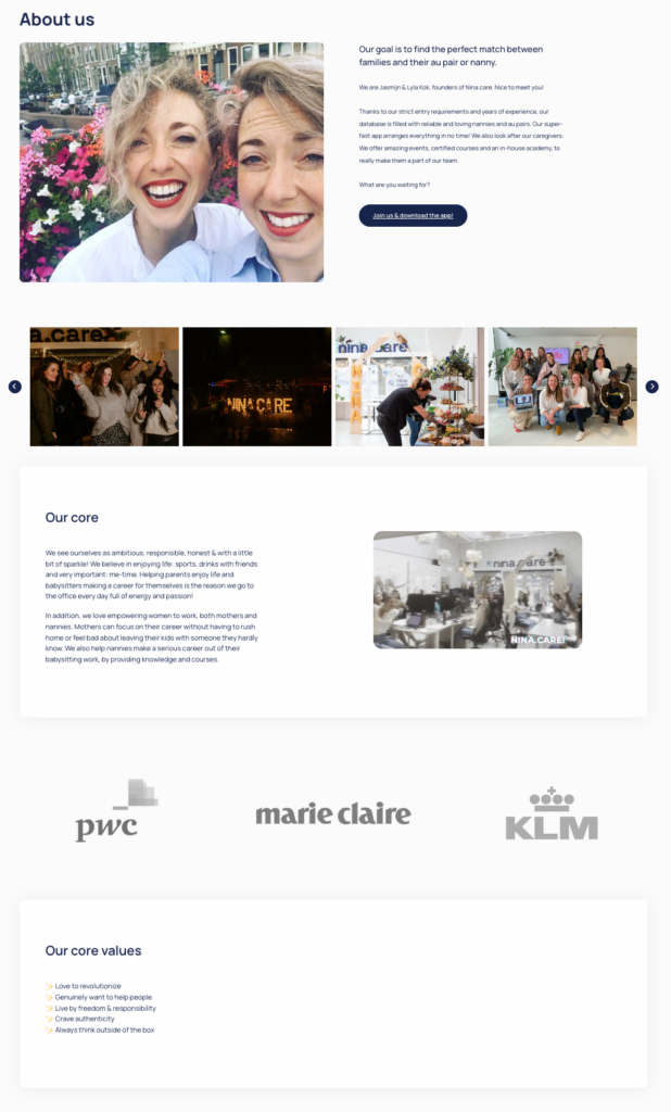
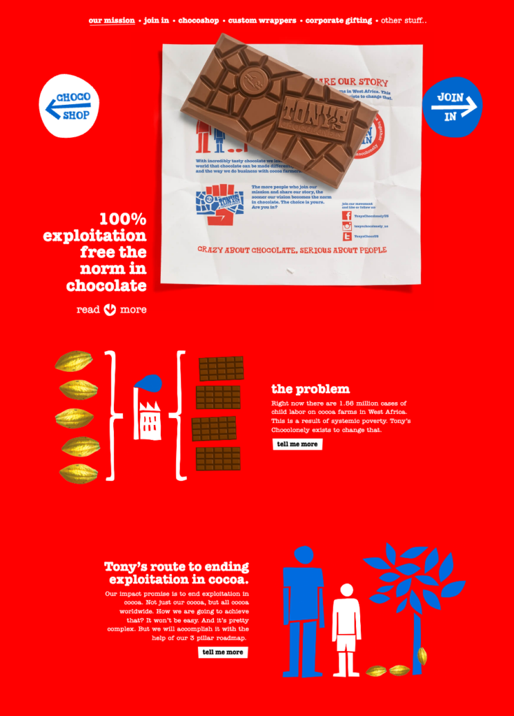
Need some inspiration? Here are a few examples of About pages that do it right:


As your site grows, you might end up with more than one About page. That’s perfectly fine. Just make sure each page serves its purpose and stays up-to-date. Review and update your About page regularly to keep it fresh and relevant.
By following these steps and examples, you can craft an About page that truly connects with your audience and builds trust. Remember, your site is never done. Keep evolving and improving it over time. For more tips on making your content stand out, check out our guide on creating unique content.

Leave a Reply